Home
The Feed
Your selections:
Data visualisation: The art and science behind making data tangible | WARC | The Feed
The Feed
Read daily effectiveness insights and the latest marketing news, curated by WARC’s editors.
You didn’t return any results. Please clear your filters.
25 November 2021
Data visualisation: The art and science behind making data tangible
Data analysis
Data management
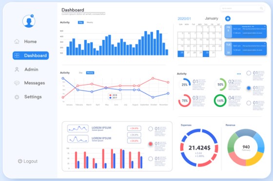
Plenty of data is available but it has to be tangible to be useful and that means more than just having a dashboard, says global marketing consultancy R3’s Penelope Siraj.
Why it matters
Raw data is unorganised and has to be contextualised; to make it useful, digital practitioners have to mould it by thinking visually and understanding who the target audience is.
Takeaways
- Digital practitioners must blend digital channels, data and insights to make them tangible.
- Data has to be contextualised so that the human brain can process the information more easily.
- Look at data beyond bar charts because demographic...
This content is for subscribers only.
Sign in or book a demo to continue reading WARC’s unbiased, evidence-based insights that save you time and help you make marketing choices that work.
Email this content
